INLAND OCEANS - REDEFINING HEALTHY SEAFOOD
The Inland Oceans team came to us with a bold idea and a compelling problem to solve: the world needs a better quality shrimp. Not just better tasting, but better for the consumer, better for the environment, and better for the future of our oceans. Their mission was clear. What they needed was a brand powerful enough to carry it.
Campbell Creative partnered with Inland Oceans from the ground up, building a comprehensive brand system rooted in three uncompromising cornerstones: flavor, sustainability, and quality. We developed a visual and verbal identity designed to challenge the stigma of farmed seafood and replace it with something the market had never seen before; a land-based shrimp company that consumers could trust, chefs could champion, and the planet could benefit from.
From naming architecture and brand positioning to logo design, color systems, typography, collateral, and messaging, we engineered a brand with the depth and clarity to speak to multiple audiences at once. The discerning chef, the conscious shopper, the savvy restauranteur. All without ever losing its singular voice.
The result is a brand that balances scientific innovation with genuine, human storytelling. One that is approachable, credible, and built to grow alongside a movement that is only just beginning: the future of sustainable seafood, grown right here on Florida soil.
SEAFOOD FOR A HEALTHY PLANET
76,452
shrimp raised while we created the brand
523
perfectly amazing shrimp taste tested
56
fun facts about shrimp farming
3
tours of the new facility to learn about the process

LOGO, COLOR + IDENTITY SYSTEM
Inland Oceans came to us needing more than a logo. They needed a brand strong enough to challenge decades of consumer skepticism around farmed seafood and position them as the future of sustainable aquaculture.
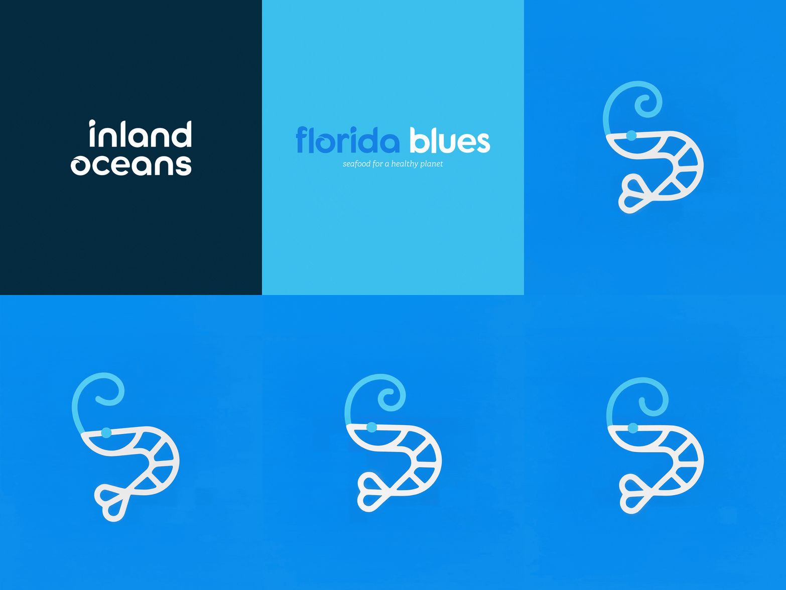
The primary wordmark pairs "inland" in deep navy with "oceans" in a soft water blue, a deliberate two-tone choice that tells the brand story at a glance. Land meets sea. The "o" in oceans features a signature swirl, a nod to water in motion and the living environment inside every Inland Oceans tank. From there, we developed two supporting marks: the "io" icon for scaled-down applications, and a circular shrimp badge built for packaging, apparel, and beyond.
The color palette does the heavy lifting on brand perception. Navy anchors the brand in trust and credibility. Water blue and teal connect the product back to its ocean origins. Emerald green signals sustainability and growth, a quiet reminder that what is good for the table is also good for the planet.

WHERE THE BRAND MEETS THE REAL WORLD: COLLATERAL DESIGN
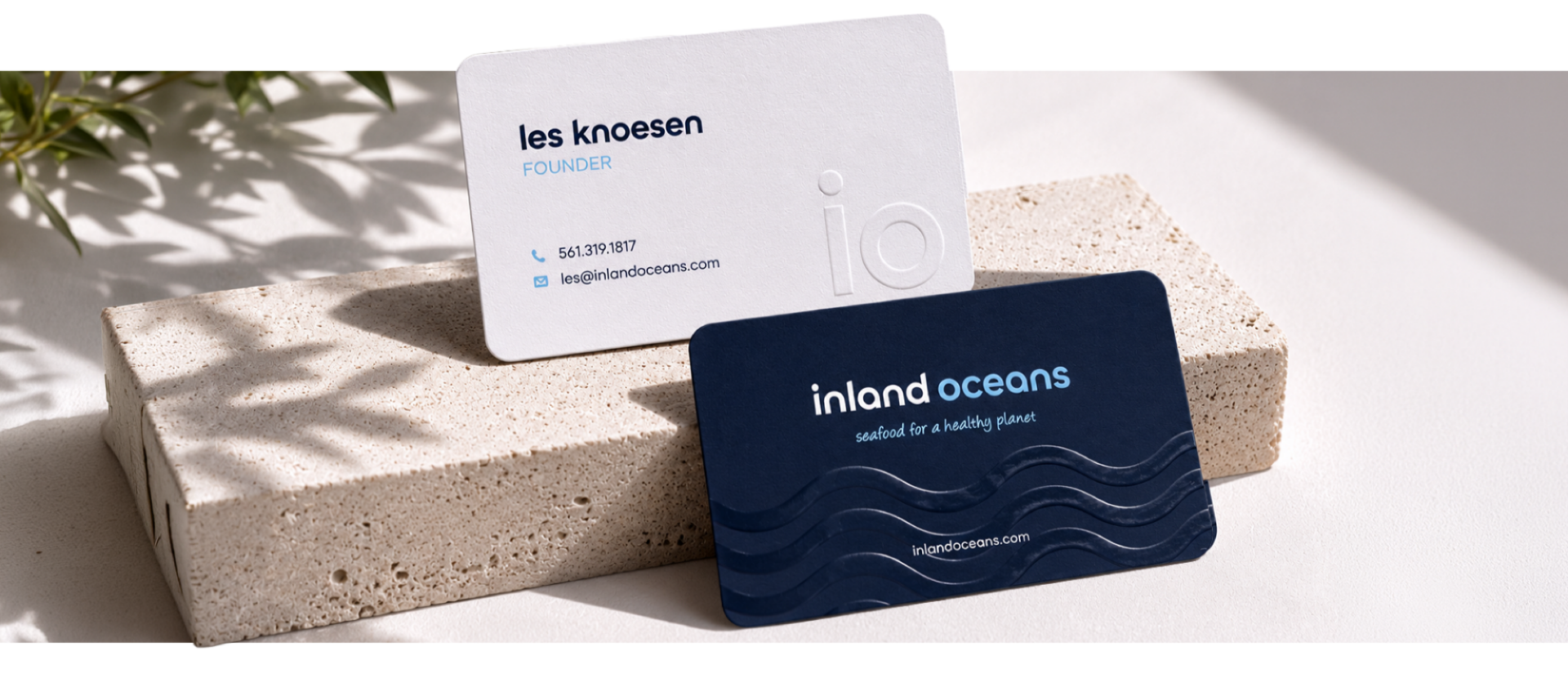
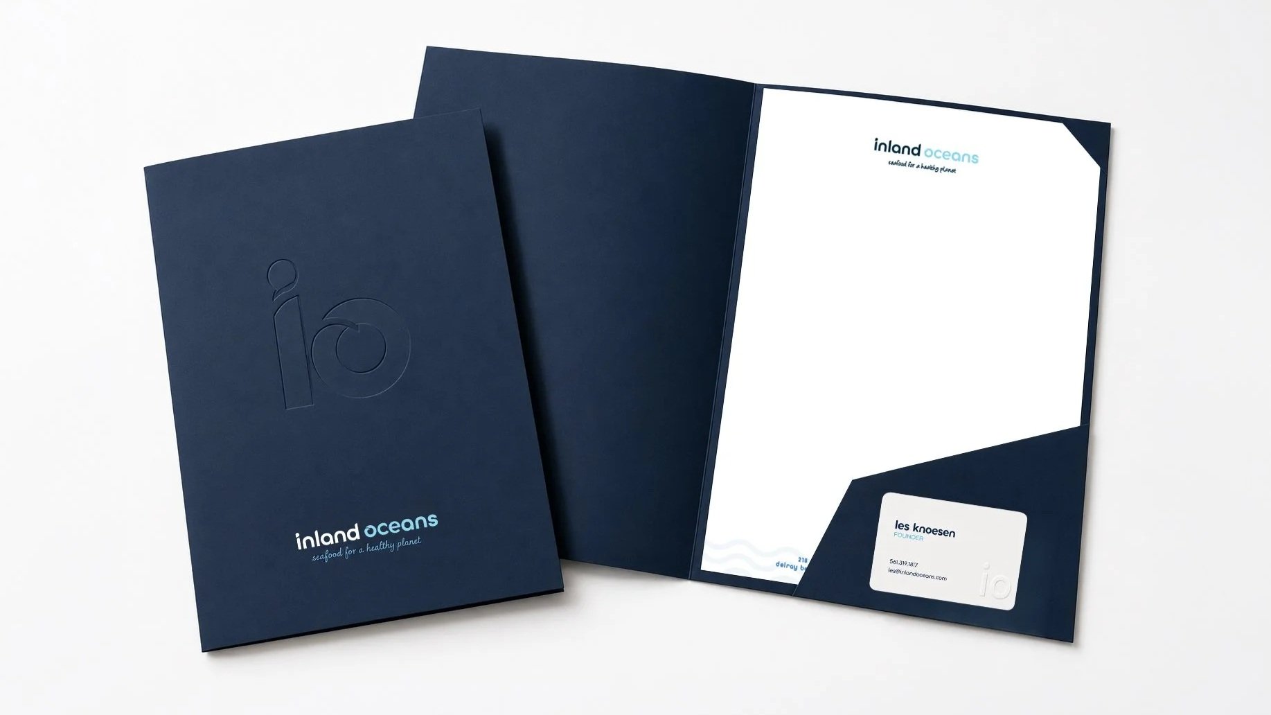
Every touchpoint is an opportunity to reinforce trust, and for Inland Oceans, first impressions matter. We designed a complete suite of branded collateral to carry the identity from the screen into the hands of the people who matter most — the chefs, restaurateurs, and distributors who would ultimately decide to bring this product to their tables.
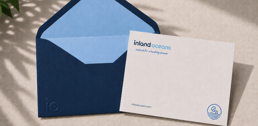
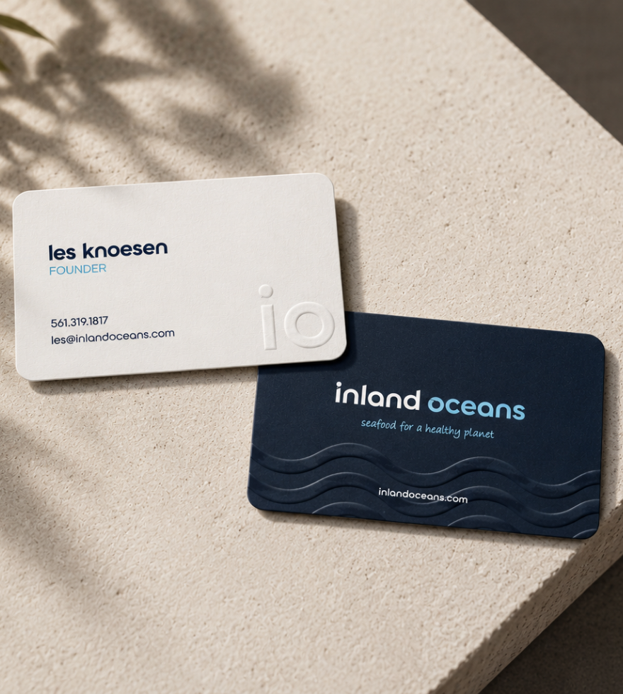
The suite includes business cards, letterhead, notecards, and a custom sales folder, all built to support the Inland Oceans team as they hit the road and walk into restaurants, markets, and distribution centers to sell their story in person. Every piece stays true to the brand's deep navy and water blue palette, clean typography, and the quiet confidence of a company that knows exactly what it stands for. Nothing overdesigned. Nothing cluttered. Just a brand that shows up looking as premium as the product it represents.
FLORIDA BLUES: BUILDING A SUB-BRAND WITH ROOM TO GROW
From the beginning, Inland Oceans had bigger ambitions than a single product. So when it came time to name and brand their shrimp line, we approached it with that future in mind. The result is Florida Blues, a sub-brand designed to stand confidently on its own while remaining unmistakably connected to the Inland Oceans family.
The name was chosen from a framework built around three naming territories: geography, quality, and brand. Florida Blues lands squarely at the intersection of all three. It roots the product in its origin, nods to the water blues of the parent brand palette, and carries a personality that feels fresh, approachable, and premium without taking itself too seriously.
The Florida Blues mark shares the same circular shrimp badge icon as the parent brand, adapted in a brighter blue to give the sub-brand its own distinct energy while keeping the family resemblance intact. It is a brand built to live on packaging, menus, and market shelves, but designed with enough flexibility to welcome whatever comes next.
WHERE THE BRAND MEETS THE SHELF: PACKAGING DESIGN
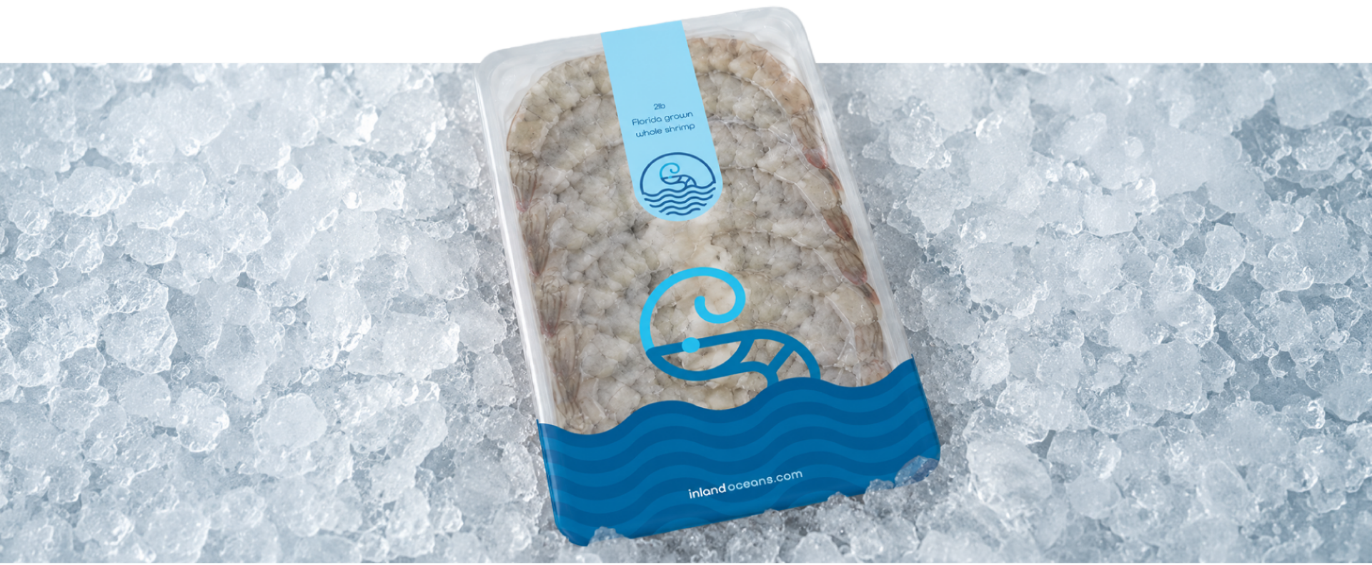
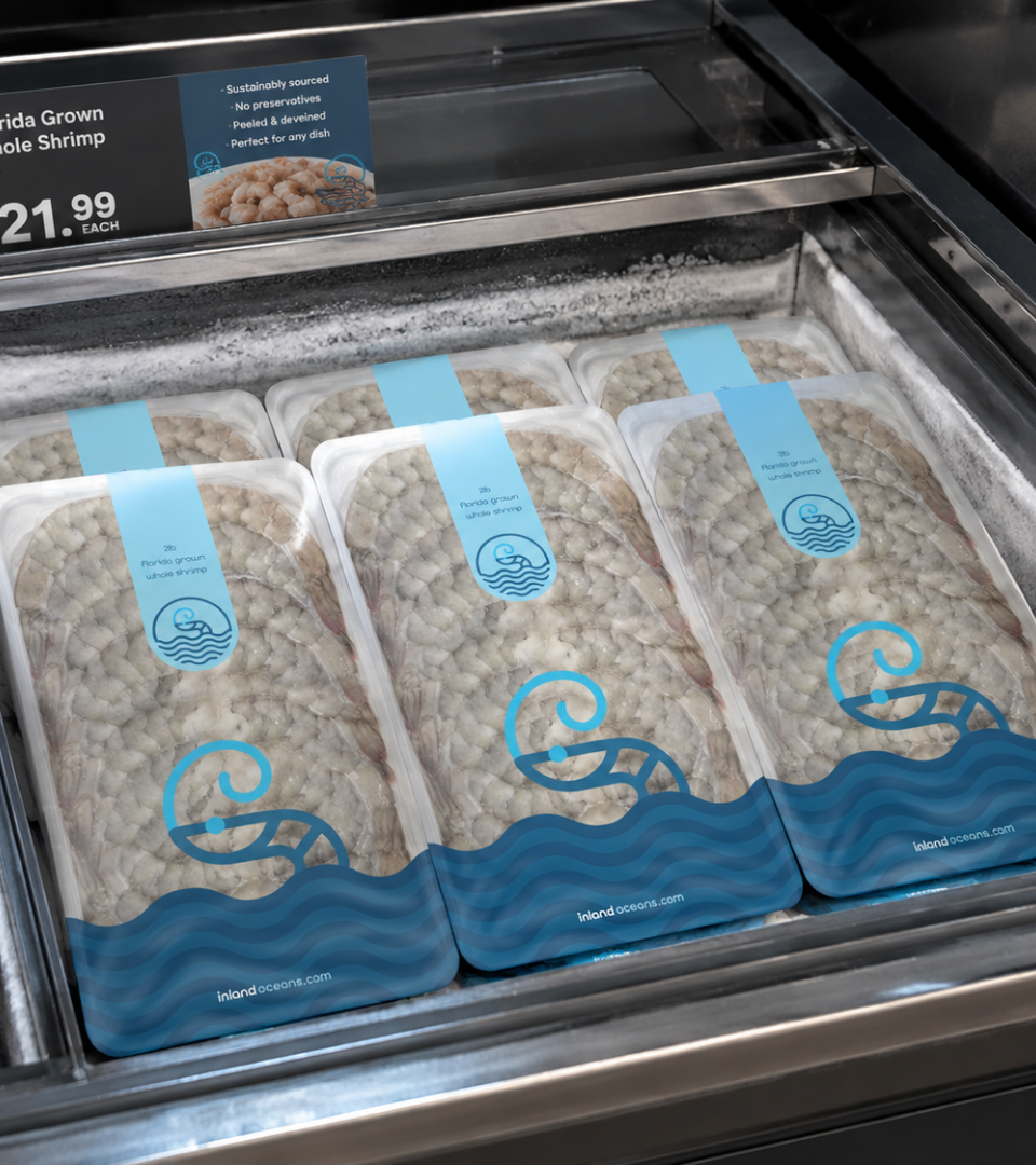
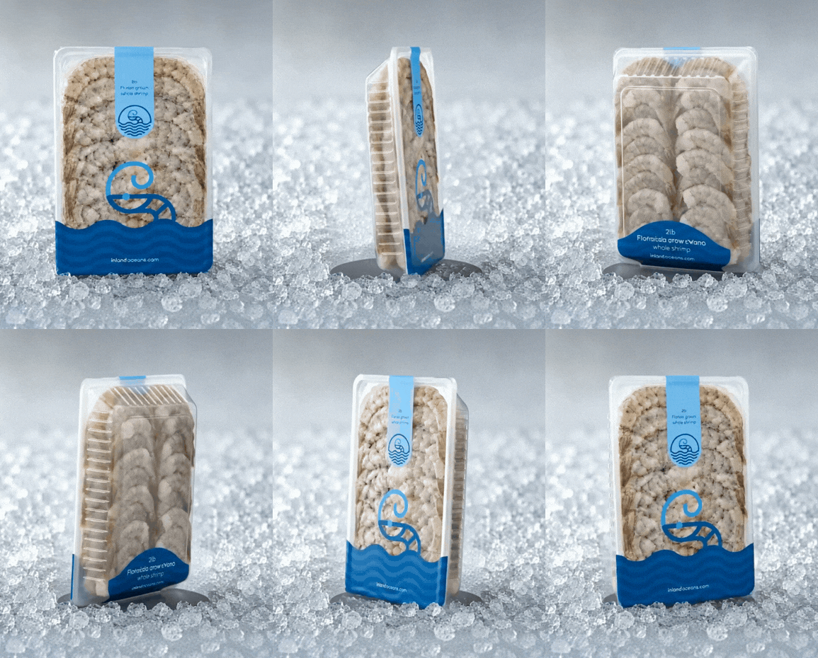
Packaging is where the brand stops being a concept and becomes a product. It is the moment a chef reaches into a delivery box, a buyer scans a market shelf, or a consumer picks something up and decides in three seconds whether they trust it. For Inland Oceans, that moment had to be perfect.
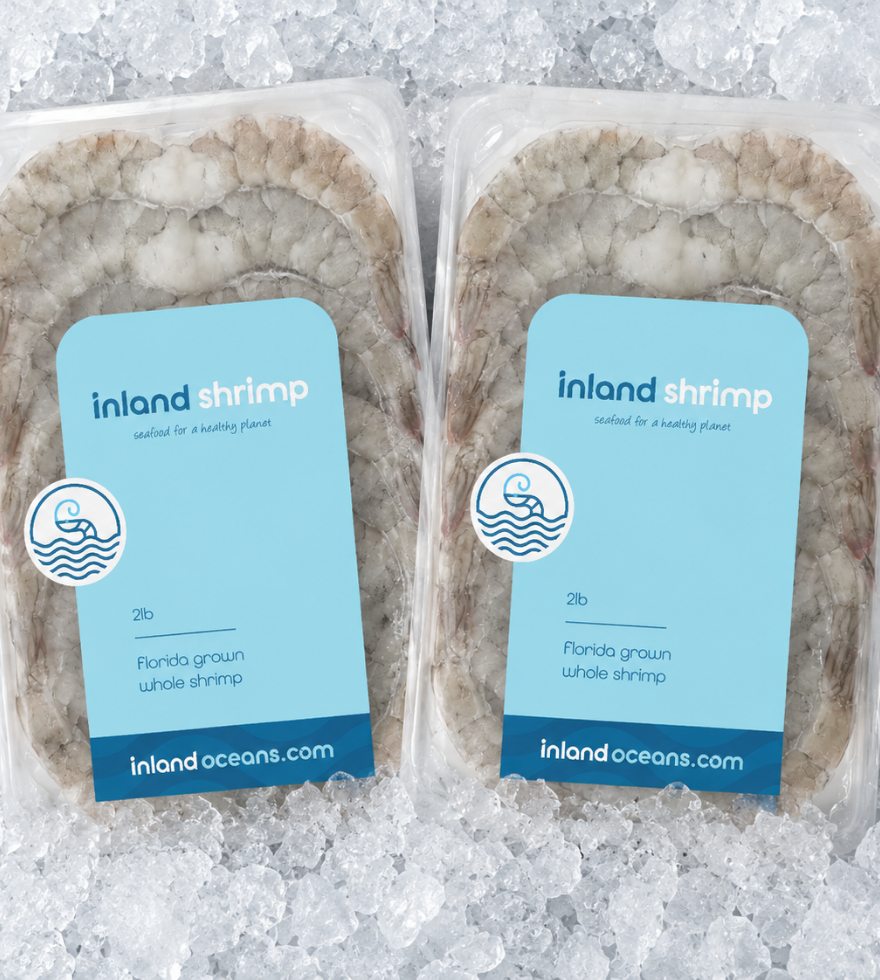
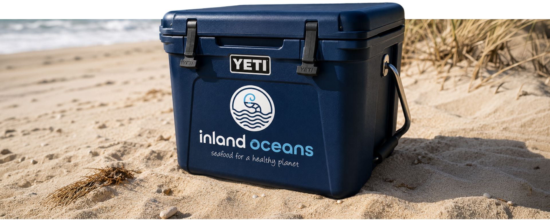
We designed packaging that leads with the Florida Blues sub-brand mark, letting the product identity do the heavy lifting at point of sale while keeping the Inland Oceans family name present and proud. The result is a package that feels as clean and premium as the shrimp inside it. Navy and water blue dominate the palette, the shrimp badge mark anchors the design, and every detail from the typography to the finish was chosen to reinforce one simple message: this is not your average shrimp.
Nothing on the shelf looks like this.
That was the point.
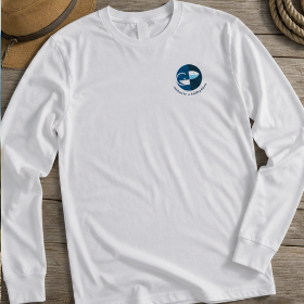
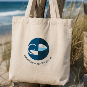
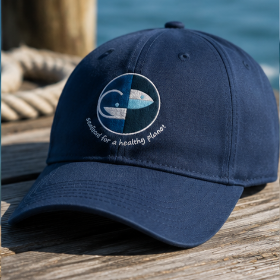
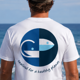
WEARING THE BRAND: APPAREL + EVENTS
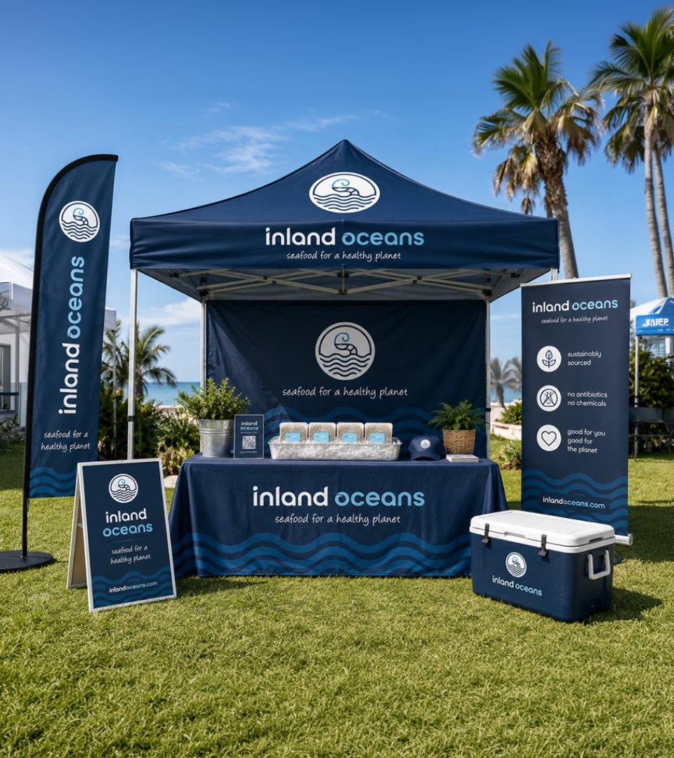
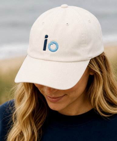
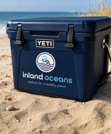
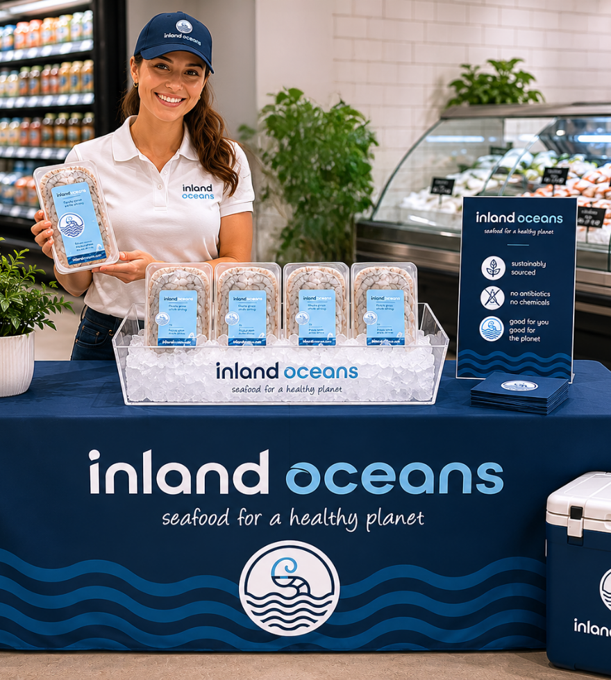
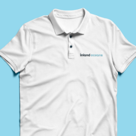
A brand that only lives on paper and screens has limits. When Inland Oceans shows up at a farmers market, a food festival, or a chef tasting event, the team needs to look the part. Apparel is how a brand walks into a room before anyone says a word.
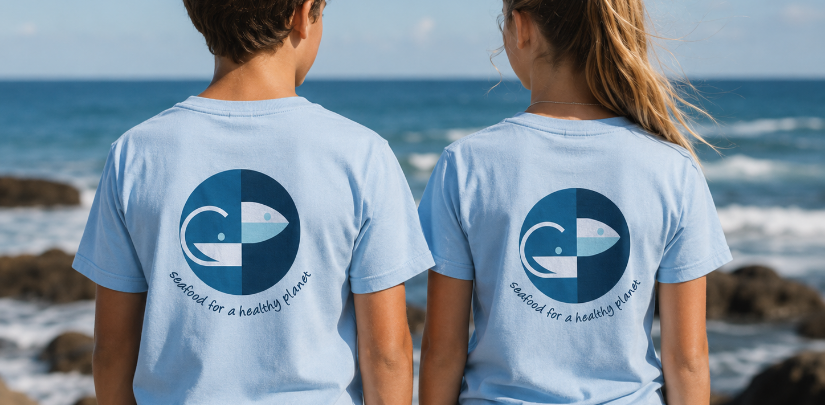
We designed a collection of branded apparel and event pieces that bring the Inland Oceans identity off the page and onto the people behind the product. Clean, wearable, and built around the same navy and water blue palette that runs through every other touchpoint, the apparel line gives the team a unified presence that feels as premium as the brand they are representing.
Whether it is a hat at a weekend market or a jacket at an industry event, every piece is a conversation starter. And in a business built on relationships, that matters.
WHERE THE BRAND GOES DIGITAL: WEBSITE DESIGN
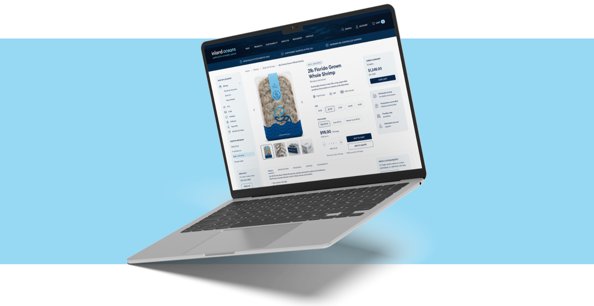
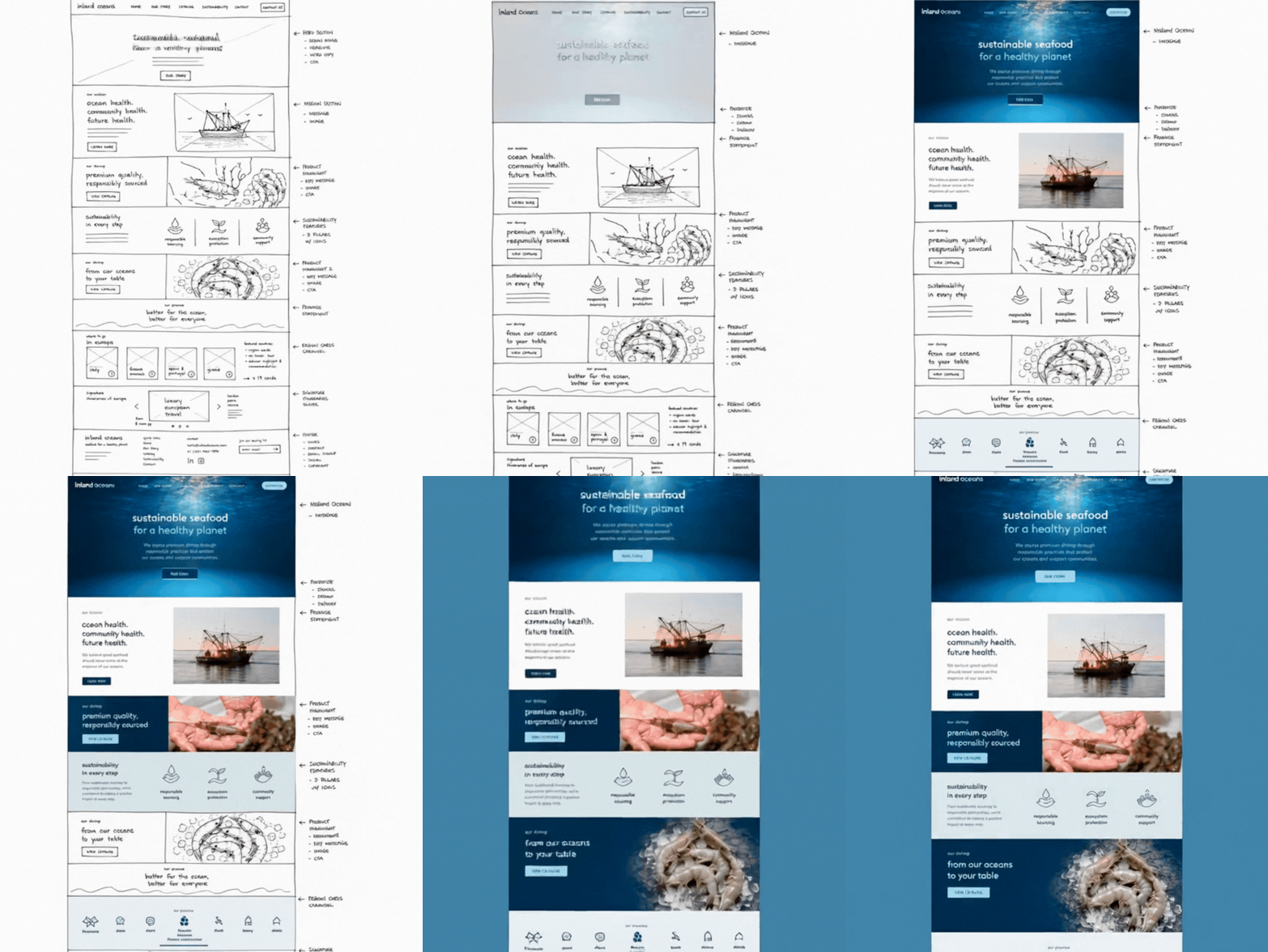
Building the Inland Oceans digital experience meant thinking far beyond a homepage. We designed and developed a full website ecosystem built to serve every audience the brand speaks to, from the chef placing a bulk order to the conscious consumer discovering the brand for the first time.
The site was architected around five clear destinations: the homepage, the company story, the shrimp, the shop, and contact. Each section moves the visitor through a deliberate journey, from understanding who Inland Oceans is, to believing in what they stand for, to taking action.
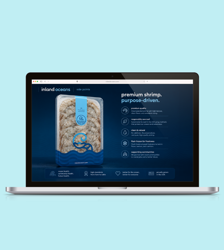
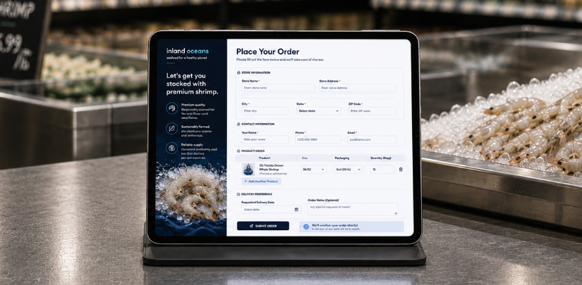
We built a fully functional place and order form, giving chefs and distributors a seamless way to request product directly from the site. The point of sale page was designed to convert, pairing premium product photography with clean, confident copy and a frictionless path to purchase.
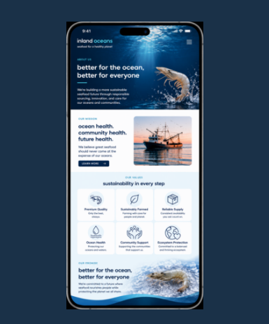
Mobile was treated with the same intention as desktop. Every layout, every interaction, and every touchpoint was optimized for the way today's buyers actually browse, on their phones, between services, in the middle of a busy kitchen.
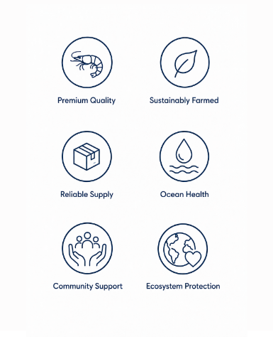
To complete the digital suite we designed a custom icon set built specifically for the brand. Not stock. Not generic. Icons that speak the same visual language as the rest of the identity, giving the site a level of craft and consistency that sets it apart from anything else in the category.