

INTRODUCING VITA: WHERE MEDICAL MEETS MOTHER NATURE
The Vita team came to us with a clear direction: take their existing logo and create a comprehensive brand that speaks to their vision and mission. Their goal was to convey a unique culture to the world in a way that resonates with a specific clientele seeking a balance between clinical professionalism and holistic wellness.
Starting with only a logo, Campbell Creative engineered a robust design system to transform a singular mark into a complete sensory experience. We expanded the brand’s identity by rooting it in an "interdisciplinary care" model, creating an intentional visual and verbal language designed to replace the often overwhelming and fragmented journey to wellness with clarity and confidence.
From the curation of intimate physical environments to the development of user-friendly digital interfaces, we built a brand with the "legs" to support innovation and trust across every touchpoint.
The result is a brand that balances scientific credibility with human empathy. A brand that is approachable, informative, and built to empower individuals to reconnect and thrive.
WHERE MEDICAL MEETS MOTHER NATURE
1
lonely logo that came to us looking for a personality.
5
core brand pillars engineered to turn a medical concept into a movement.
12
gallons of cold brew consumed while obsessing over "V/A" mirror symmetry.
1
"Sanctuary" created to redefine what it means to prioritize wellness.

from a Logo
to a system
The vita identity is rooted in the balance between science and humanity. The name is derived from the Old Latin word for life , while its modern connection to vitality emphasizes a state of being strong and active. While the core logo was established, we expanded the brand into a comprehensive system inspired by organic symmetry. This reinforces the company’s mission to simplify the wellness journey with clarity and confidence.
A clean and modern color theory was engineered to evoke feelings of calm and renewal while grounding the clinical nature of the brand.

This system is rooted in four elemental categories
Wood | Water | Stone | Plants
This visual language is supported by a custom icon system that echoes the logo's organic movement. These elements create a cohesive and approachable experience across digital platforms, physical spaces, and patient collateral.

VITAL TOUCHPOINTS: WHERE SCIENCE MEETS THE SOUL
The Vita identity is a study in intentional balance. We evolved a "lonely logo" into a comprehensive sensory language that guides patients from their first discovery to their final step toward vitality.
The Tri-Fold Experience: More than a brochure, this custom die-cut piece acts as a structural invitation. Printed on heavy, uncoated cotton stock, it replaces clinical coldness with tactile warmth.
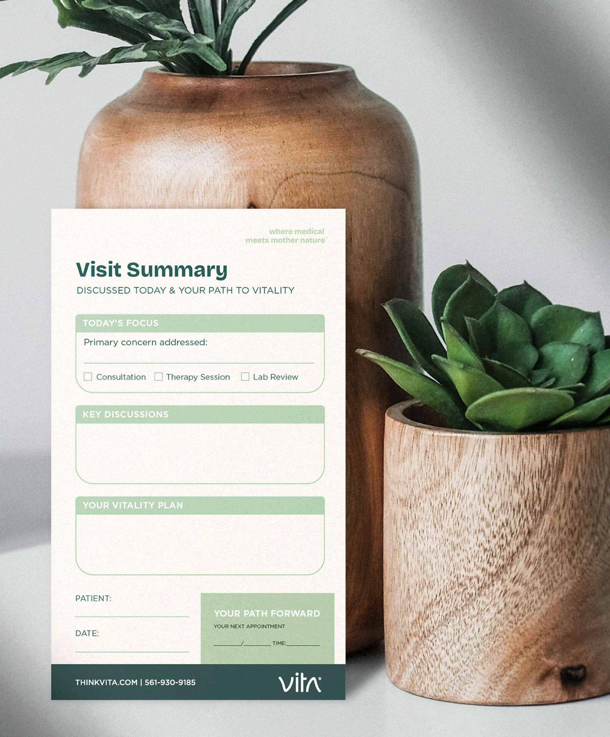
The Visit Summary: A reimagined post-consultation roadmap. By merging scientific rigor with a human touch, these cards anchor each patient’s name at the foundation of their wellness journey.
The Clinical Suite: From Neurofeedback sheets to service menus, we engineered layouts that honor both science and serenity, translating complex data into a scannable, supportive narrative.
The Handshake: Our business cards emphasize the Architecture of Balance found in the logo’s symmetry. Every touchpoint makes the Vita ethos—"Where Medical Meets Mother Nature"—truly palpable.


DIGITAL SANCTUARY
HEALTHCARE WEB DESIGN
meets UX STRATEGY
Vita required a digital presence that mirrored the serenity of its physical clinic while maintaining the authority of its medical expertise. We delivered a conversion-focused web design solution, leading the brand strategy, UX research, and custom development to create a virtual sanctuary. The interface was engineered with a precise visual hierarchy to balance clinical credibility with patient emotional well-being.
We translated Vita’s interdisciplinary approach into a clear, intuitive user journey, utilizing overarching sanctuary imagery and strategic white space for maximum readability. By integrating the four elemental color palettes and mobile-responsive typography, the site serves as a calming entry point for patients exploring complex therapies like neurofeedback. The result is a cohesive digital ecosystem that strengthens brand equity, simplifies the path to care, and positions the website as a high-performing tool for patient acquisition.


THE BRANDED PRESENTATION: EVERYTHING ON DECK
When introducing a new name to the market, the first impression is everything. We designed a high-end presentation system for Vita that makes "Medical meets Mother Nature" feel like a professional standard. We made sure every slide was "on deck" so the team could present with total confidence.
Professional Clarity: We used a clean, balanced layout that keeps the focus on the message, making complex wellness concepts easy to understand.
The Signature Look: By blending our natural wood textures with modern fonts, the presentation feels both high-tech and human.
Visual Breathing Room: Following our "Architecture of Balance," we designed each slide with space for the eye to rest, ensuring the audience stays calm and engaged.
Ready to Scale: This toolkit allows the Vita team to create new branded pieces that always stay unified, consistent, and iconic.

TANGIBLE SOLUTIONS, UNMISTAKABLE BRAND
For Vita, the digital experience was only the beginning. Campbell Creative took the "Architecture of Balance" and extended it into the physical space through a custom product ecosystem. Our task was to strip away the cold, impersonal feel of traditional medical branding and replace it with an inviting, high-end identity that stays true to the brand’s mission.
By branding the client’s proprietary blends and clinical supplies, we ensured every touchpoint felt intentional. We led the packaging design and naming strategy for the entire line, swapping out sterile clinical plastics for premium matte and frosted finishes. Applying the brand’s strategic color theory to every label created a seamless visual thread that connects the website directly to the treatment room.
The result is a brand experience that feels as grounded and professional as the science behind it. By turning medical supplies into sophisticated clinical tools, we helped Vita build deep patient trust and stand out as a unique leader in the neuro-integrative space.


SENSORY ONBOARDING: MORE THAN A GIFT
For Vita, the patient experience doesn't stop at the clinic door. Campbell Creative designed a premium Onboarding Kit that bridges the gap between high-tech treatment and daily life. Our goal was to move away from "promotional swag" and create a purposeful suite of tools where every item serves a specific role in the patient's neurological recovery.
We led the product strategy and custom curation, selecting high-end essentials that provide immediate grounding. The kit features a weighted blanket and relaxing sleep mask for deep recovery, alongside a matte-finish travel bottle and mug for hydration and proprietary tea blends. We even designed the enclosure box itself as a permanent storage solution, giving patients a dedicated space to put away their phone and store their treatment journal.
By applying our strategic color theory and using tactile finishes like embossed textures and frosted glass, we stripped away the coldness of traditional medical branding. This kit isn't just a giveaway—it’s a tangible extension of the Vita protocol. This level of intentionality builds trust from day one and proves that Campbell Creative doesn't just build brands; we build complete patient ecosystems that drive long-term engagement.


ENVIRONMENTAL DESIGN: THE NEURAL SANCTUARY
We didn't want Vita to feel like a doctor’s office. Our goal was to build a physical version of our tagline: "Where Medical Meets Mother Nature". We used the brand's "Architecture of Balance" to turn a high-tech clinic into a place that feels like home.
Natural Textures: We brought in real Birch and Pine woods to give the space a sense of "stability and reliability".
The Power of Green: We installed custom moss walls using our Evergreen and Moss colors to represent "renewal" and help lower patient anxiety.
A Place to Breathe: Following our brand's "Clean" personality, we kept the layout open and light so the eye always has a place to rest.
Tactile Finishes: Instead of cold, glossy surfaces, we chose matte and natural materials that feel sturdy and authentic to the touch.
By matching the interior design to our brand colors, we made sure the space itself helps the patient heal. It’s not just a building; it’s the Vita brand in action.


